Case study
Typography as Visuals
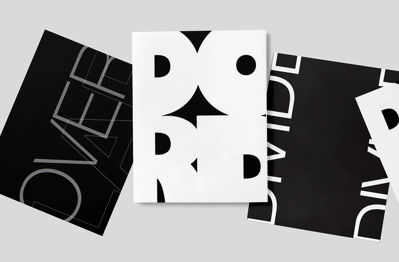
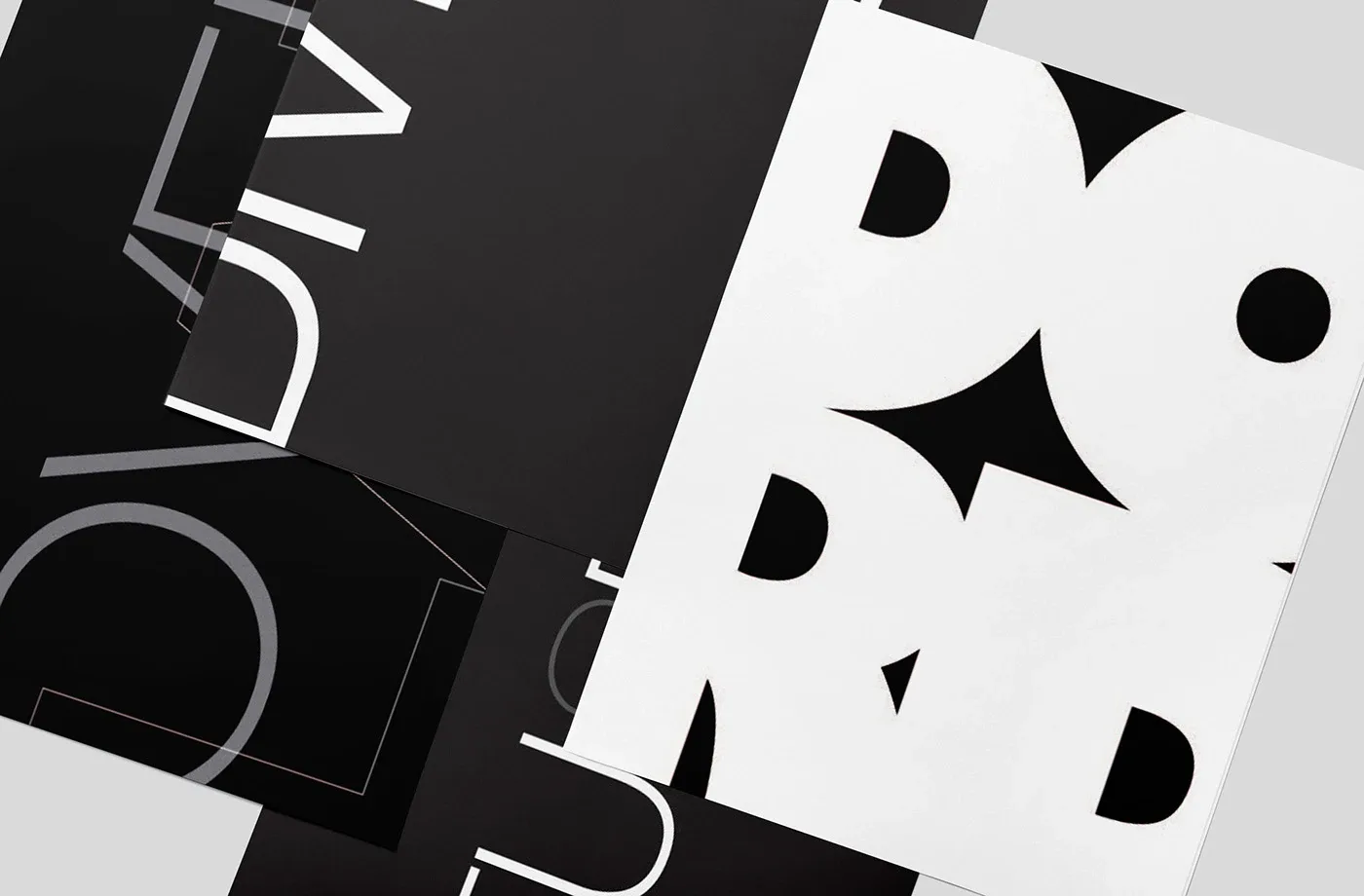
A black-and-white poster series where oversized, cropped and overlapping letterforms become the image.
- Graphic Design
- Illustration
- Advertising
Overview
This is a series of typographic posters exploring what happens when letters stop being text and start acting as image. Each poster uses a single word, set so large that it is cropped by the edges of the page. I kept the whole series in black and white and worked in Illustrator, InDesign and Photoshop.
Challenge
The goal was to make type carry an entire poster with no photos or illustration. When a word is blown up and cut off, it can quickly become unreadable or just decorative. I wanted each composition to hold together as a graphic while still hinting at the word behind it.
Approach
I treated each poster as its own experiment with the same limits: one word, black and white, and letters pushed past the edges. On one, thin outlined letters overlap in gray on black so the strokes stack into a new shape. On another, heavy white letterforms on a white field meet black counters and gaps, so the negative spaces form sharp star-like shapes. A third runs DIVIDE in a light sans serif, rotated and split between panels so the word is literally divided. The contrast between fine outlines and heavy shapes keeps the set varied but related.
Outcome
The series is a set of print posters, shown here as mockups laid out together and overlapping, so the cropped letterforms read across sheets as one larger composition as well as individual pieces.
More work
Intervene: Risograph Prints
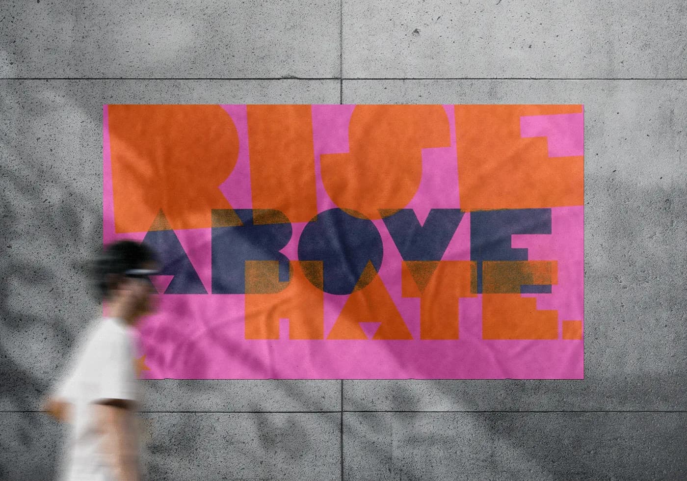
Risograph posters reading Rise Above Hate in layered geometric type, made for the Disobedient Design course at MassArt.
Empower: Letterpress Voting Posters
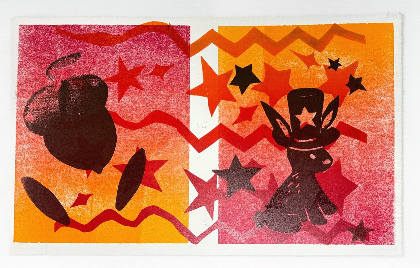
Letterpress posters for the 2024 U.S. election season, set in wood type to get the MassArt campus talking about voting.
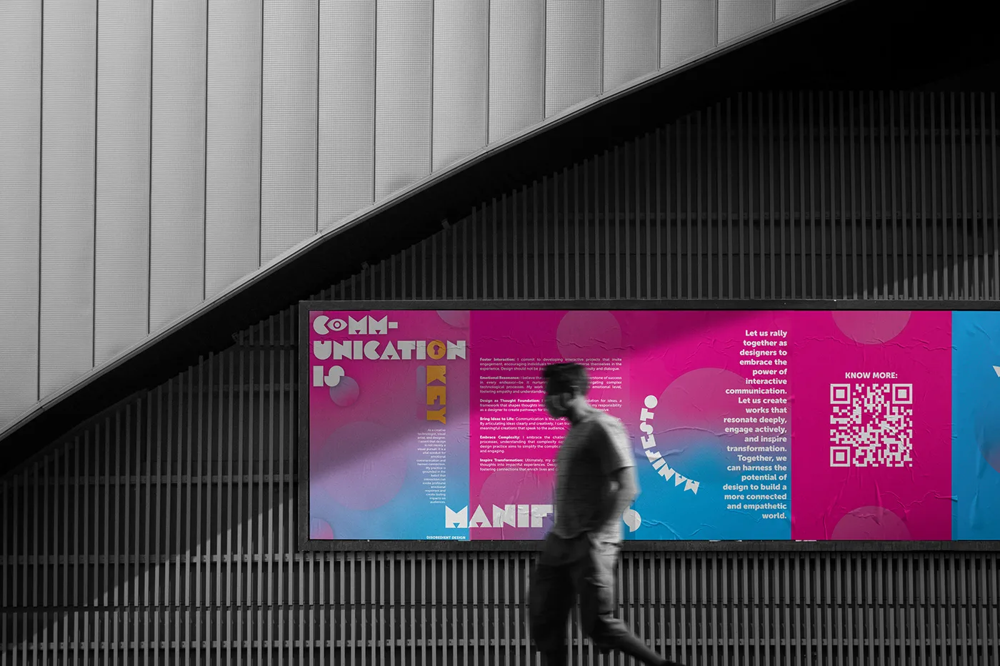
Designer's Manifesto
A personal design manifesto told through gradient posters and a QR link, arguing for communication, interaction and originality over trends.