My logo design process has seven stages, and drawing is only the fourth. Before that comes a written brief, a look at what the category already does, and one sentence that says what the mark is about. After the drawing comes the part most people skip: stress tests at tiny sizes, in one colour, on dark backgrounds, and a clearance search to make sure the mark is not too close to someone else’s. This post walks through each stage the way I actually run it, with examples from logos I have shipped.
If you want the bigger picture of colour, type, voice and guidelines, I cover that in how to design a brand identity system. This one stays on the mark itself.
Stage 1: Write the brief before anyone draws
The brief is where most logo projects are won or lost. For PrintVision, my family’s printing and packaging house in Lahore, sixty pages of brand foundation were written before a single mark was drawn: purpose, positioning, audience, competitors, personality and tone. That is the extreme end. For a small business, I want at least these answers on one page:
- What the business does, in one sentence a customer would say. Not the mission statement, the plain version.
- Who it is for, and what they are nervous about. A pharmaceutical buyer choosing a packaging supplier worries about different things than a teenager choosing a festival.
- Three personality words, and three words it must never feel like. The “never” list is usually more useful.
- Where the logo will live most. A van, an app icon, embroidered scrubs, a pharmacy shelf. This decides how much detail the mark can carry.
- What has to survive from the old logo, if anything. Recognition you already paid for is worth keeping on purpose, not by accident.
A mark drawn before the positioning is decoration. Decoration is the thing a company quietly stops using two years later.
Stage 2: Study the category, then put the research away
Next I collect what the competitors and the wider category look like. For Budz, a cannabis retail brand concept, I built a mood board of dispensary interiors and dozens of existing cannabis logos. It made the problem obvious: almost everything fell back on the same leaf icons, cartoon mascots and in-jokes.
That is the real value of category research. It shows you the clichés so you can avoid them, and it shows you the conventions customers rely on so you do not break the useful ones. Then I set the board aside. Designing while staring at competitors is how you end up with a slightly different version of them. For Budz I went type-first instead, with a very wide, blunt display face and a hand-drawn bud that grows out of the counters of the B and D, which kept a friendly link to the plant without using the leaf everyone else used.
Stage 3: Find one idea worth drawing
A good logo carries one idea, not five. I look for something true about the business that can become a shape. Three examples from my own work:
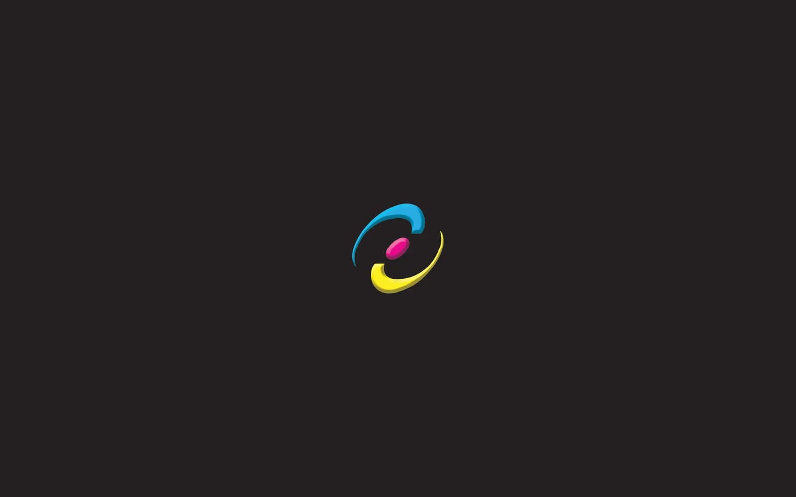
- PrintVision: the mark starts with a boomerang, because a boomerang returns, the way repeat clients come back to a printer. Two of them overlap into a circle for the company’s “360 degree printing solutions under one roof.” The curves also echo the ink rollers on the press floor, and the colours are the four process plates: cyan, magenta, yellow and a charcoal key.
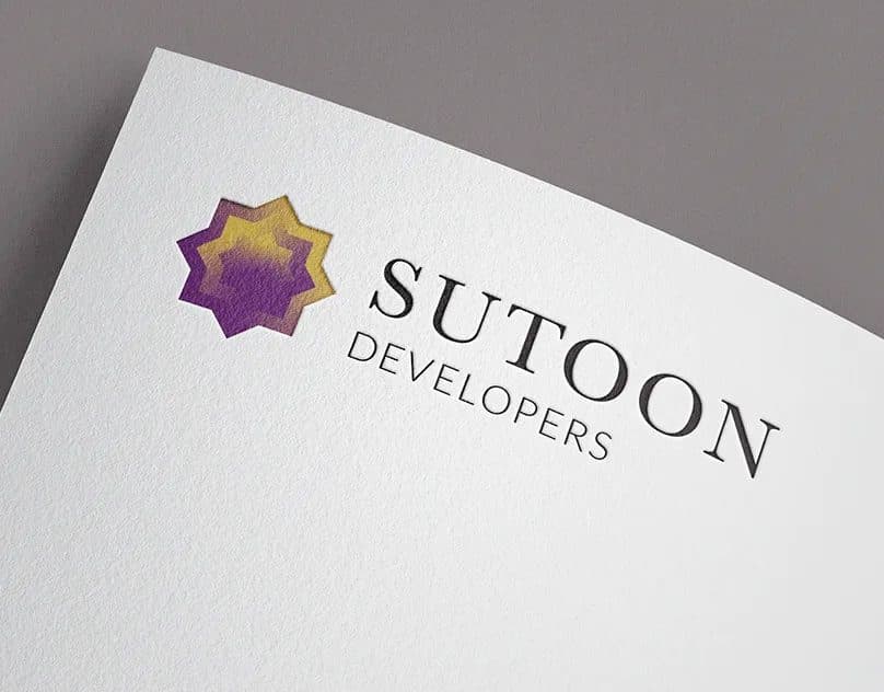
- Sutoon Developers: a real estate developer that needed to feel established on a letterhead and still be recognisable on a pin button. I built the mark from nested eight-point stars, a geometric form with roots in traditional patterning, filled with a purple to gold gradient so the layers read as depth.
- TradeVision: a trading and investment firm. Three bars, green, red and green, which recall a market chart without turning into a literal stock graph.
Notice that none of these needs the story to work. The PrintVision curve reads as a boomerang if you know the philosophy and as a roller in motion if you have stood next to the press. I aim for a shape that is good alone and better once explained.
When not to chase a symbol at all
Sometimes the right answer is a wordmark with no icon. If the name is short and distinctive, or the business is a person (a consultant, a clinic named after its founder), a carefully drawn wordmark often beats a forced symbol. An icon earns its place when it will be used alone: app icons, social avatars, favicons, embroidery.
Stage 4: Sketch wide, then narrow fast
I start on paper or in rough vector, in black only. Colour hides weak shapes, so I keep it out until the form works. I push for range early: literal and abstract routes, symbol plus wordmark, wordmark only, a letter mark. Then I cut hard.
The two or three survivors get refined in vector. This is slow, unglamorous work: optical balance, consistent stroke weights, curves that meet cleanly, letter spacing in the wordmark adjusted by eye rather than left at the font default. For Sutoon, the wordmark is a spaced serif for SUTOON over a light sans for DEVELOPERS and the relationship between those two lines matters as much as the star does.
A word on fonts in logos
If the wordmark starts from an existing typeface, read that font’s licence before the client falls in love with it. Licences differ on logo and commercial use. It also helps to understand that the U.S. Copyright Office’s Circular 33 says copyright law does not protect typeface or mere variations of lettering, and that familiar symbols and designs, or a simple combination of a few of them, cannot be registered for copyright. A larger design that contains enough creative expression can be. In practice, that is one more reason a logo built only from a stock font and a basic shape is weak protection for a brand, and why I usually modify letterforms or pair them with an original mark.
Stage 5: Stress test it until it breaks
This is the stage that separates a logo from a nice picture. I run every finalist through the same tests:
| Test | What I check | Common fix |
|---|---|---|
| Tiny size | Is the icon still readable as a browser tab icon and a social avatar? | A simplified icon with fewer layers and thicker gaps |
| One colour | Does it work in solid black and reversed out in white? | Replace gradients with shapes that carry the depth |
| Dark and light backgrounds | Does any part disappear? | A dedicated reversed version, not just inverted colours |
| Production methods | Embroidery, vinyl cutting, foil, emboss, a single-plate print job | Remove hairlines and tiny counters |
| Real mockups | Business card, sign, website header, uniform, invoice | Adjust proportions between symbol and wordmark |
Favicons deserve a specific mention. Google’s favicon guidelines for Search say the favicon must be square (1:1) and at least 8 by 8 pixels, and recommend going larger than 48 by 48 pixels. A wide horizontal logo will not fit a square, so a business that only has a horizontal lockup ends up with a squashed or unreadable icon next to its search results. I design the square icon as a deliberate part of the family.
The one-colour test is why the PrintVision mark is specified down to a single plate, so it survives one-colour jobs, foil, emboss and deboss without being redrawn. The Sutoon gradient is beautiful on paper, but the star shape had to hold up flat too, because a pin button or a one-colour stamp will not reproduce the gradient.
Contrast: what the rules say and what I do anyway
Accessibility rules are more relaxed for logos than many people assume. The W3C’s guidance on WCAG contrast (minimum) says text that is part of a logo or brand name has no contrast requirement, while normal text needs at least 4.5:1. The non-text contrast guidance also exempts logos, but notes this can be a problem when a logo acts as a link or control, and that a low-contrast presentation chosen by the author rather than required by brand guidelines is not exempt.
My take: the exemption is not a design goal. The header logo on almost every website is a link back to the home page, so I make sure every logo family includes a version with strong contrast against the site’s backgrounds, and the guidelines say when to use it. If a pale version exists for subtle uses, it is a documented exception, not the default.
Stage 6: Check that it is clear to use
A logo that resembles another company’s mark in a related market is a liability, not an asset. The USPTO’s guide to federal trademark searching explains that marks may be confusingly similar if they look alike, sound alike, have similar meanings or create similar commercial impressions, and suggests considering a private trademark attorney for clearance searches.
Searching for a logo is different from searching for a name. According to the USPTO’s page on design search codes, each design element gets a six-digit code made of a category, a division and a section, and their search system does not support reverse image searching. So I describe the prominent shapes in the mark (a star, a circle, overlapping curves), look up their codes, and look through what comes back in related goods and services. It is no substitute for an attorney’s clearance, but it catches obvious collisions before anything is printed. I’m a designer, not a lawyer, so before a client files a trademark or relies on a search, I send them to a trademark attorney.
On the symbols: the USPTO’s trademark basics page says you can use TM for goods or SM for services even before you file, and that the ® symbol is for after the mark is registered, and only with the goods or services listed in the registration. I mark that clearly in the guidelines so nobody adds a ® to a mark that is still pending.
Stage 7: Hand over a logo kit, not a single file
The last stage is packaging. A client should never have to email me for “the logo with a white background.” The kit I hand over usually looks like this:
- Versions: primary lockup, horizontal and stacked, wordmark only, icon only.
- Colourways: full colour, one colour, black, white reversed.
- Formats: vector master files and SVG for the web, PNG with transparency for everyday use, a print-ready file with CMYK values, and the square favicon and app icon sizes.
- Rules: clear space, minimum size, colour values for screen and print, and a short “never do this” page: no stretching, no recolouring, no drop shadows, no placing the full-colour version on a busy photo.
Print is where weak handovers show up first. My years around the presses, which I wrote about in print and packaging lessons from a print shop, taught me that a colour that glows on screen can go flat in CMYK, so I check print values before handover rather than after the first bad run.
A quick checklist before you approve a logo
- Can you say the idea behind it in one sentence?
- Does it still read at favicon size?
- Does it work in one colour and reversed in white?
- Is there a square icon version?
- Does it look distinct from the three competitors you worry about most?
- Has someone run a design code search, and ideally an attorney a clearance search?
- Do you have every version and format you need, without asking the designer again?
Frequently asked questions
How long does the logo design process take?
It depends far more on the brief and on decision-making than on drawing time. A clear brief and one decision-maker move quickly. A committee with no written brief can stretch the same work for months. I give a timeline once I have seen the brief.
Do I need to trademark my logo?
That is a question for a trademark attorney. What I can say is that the USPTO lets you use TM or SM before filing, and reserves ® for registered marks. Running a search before you invest in signage and print is cheap insurance.
Should I redesign my logo or just refine it?
If customers already recognise it, refining is usually smarter: clean up the drawing, build the missing versions, fix the small-size problems. A full redesign makes sense when the business has changed what it does, or the old mark fails the tests above in ways a cleanup cannot fix.
If you are starting a logo, or you have one that falls apart at small sizes, tell me about your business and where your logo needs to work. I’ll come back with an honest view of whether you need a new mark, a refinement, or just a proper logo kit.