An event brand has a strange life. It is born on a phone, spends a few weeks on walls and feeds, and ends on someone’s wrist at a door. Most festival identities are designed for the poster and then squeezed into everything else. The ones that work are designed for the whole journey from the start.
This is how I approach event and festival identity design, using my work on MultiVerse '21, a one-night music festival in Lahore put on by The Decibel Collective, as the worked example. Eleven artists, one date (3 December), a guestlist that closed on 21 November, and an identity that had to read at story size, at poster size and at twenty millimetres on a wristband without being redrawn for any of them.
Why an event identity is different from a company brand
When I build a brand identity system for a business, I am designing for years. Guidelines, a logo family, a colour system with jobs, templates for a busy Tuesday. An event identity borrows all of that thinking but runs on a completely different clock.
MultiVerse had roughly three weeks to exist in public. It did not need to be loved for a decade. It needed to be recognised twice, on a phone, by people deciding whether to keep a Friday night free. That changes the priorities:
- Recognition beats richness. You get very few exposures, so every one has to look like the last one.
- The message changes, the face cannot. Announce, lineup, guestlist open, guestlist closing. The campaign has to stay current without looking like four different events.
- The smallest application matters as much as the biggest. Accreditation, wristbands and merchandise are part of the identity, not an afterthought once the posters are approved.
In my experience, most problems with event branding come from ignoring that third point. The poster gets three weeks of attention and the wristband gets an afternoon.
Step 1: Decide what the identity is selling
Before any artwork, I want one honest answer: what does someone need to remember after a two-second glance? For an established festival, the name might be enough. For a first-year event, nobody has heard the name yet, so the name cannot do the selling.
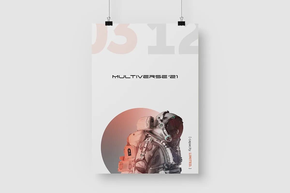
On MultiVerse I made the date the loudest element on the sheet. On the announce poster the numerals 03 12 are ghosted across the top edge at full width, bleeding off both sides, while the wordmark sits in the middle at a fraction of that size. Someone passing a pasted poster from across a street takes away one thing, and I wanted it to be the night they needed to keep free.
The other piece of context was the city. In my reading of Lahore’s electronic scene in 2021, nights ran on private rooms and word of mouth rather than ticket links. So the call to action on the artwork was a guestlist, not a “buy tickets” button, and the limited capacity was stated on the announce rather than hidden in the small print. In a guestlist city, a limited room is not a disclaimer. It is the offer.
Step 2: Pick one held image, not a universe of them
The name MultiVerse invites a galaxy. Infinite worlds, every effect in the filter menu. That is exactly why I went the other way: one photograph, one circle, one figure. An astronaut sits inside a terracotta disc on an off-white field, and that single image is reused at every size and never recomposed.
This is the decision I would repeat on any event. When the campaign window is short, restraint is what makes an identity recognisable after two exposures instead of five. If the name is already doing the conceptual work, a second visual voice saying the same thing is just noise.
A held image also makes production faster. Every new piece is a question of cropping and placement, not a fresh composition, which matters when the promoter messages you at midnight because a set time moved.
Step 3: Build one live slot for whatever is true this week
An event campaign has to say new things every few days. The way I handle that without redesigning is to give the identity exactly one moving part.
On MultiVerse that moving part is a bracketed line set small and vertical against the right edge of the artwork:
- [ capacity. LIMITED. ] on the announce poster
- [ guestlist. NOW OPEN. ] with ( until 21.11. ) on the stories
One word inside each bracket is set in the accent orange, and it is always the word that asks for an action. Everything else on the artwork stays fixed. That rule let the campaign stay current for a month without a single redesign.
I ration the accent colour on purpose. If orange shows up everywhere, it stops meaning “do this now.” Giving one colour one job is the same principle I use on business brands, just compressed into a few weeks.
Step 4: Design the Instagram story as its own format
For most of the MultiVerse audience, the story was the identity. Many people would only ever see it at 1080 by 1920 pixels, held at arm’s length, for a second or two. So I treated the story as a first-class format rather than the poster shrunk.
Know the frame you are designing into
Stories are a 9:16 vertical frame. For paid placements, Meta’s ads guide for Instagram Stories image ads lists a 9:16 aspect ratio and a recommended resolution of 1440 by 2560 pixels, with JPG or PNG files. A 1080 by 1920 file is the same 9:16 ratio at a lower resolution, which is what I designed the MultiVerse stories at.
Respect the parts of the screen you do not own
The interface covers the edges of a story. The same Meta ads guide advises leaving roughly 14% of the top, 35% of the bottom and 6% on each side free from text, logos or key creative elements, because profile icons and call to action buttons sit there. The Stories video ad spec gives the same proportions. On a 1080 by 1920 canvas, that works out to about 269 pixels at the top, 672 pixels at the bottom and 65 pixels on each side.
Those numbers are written for ads, but I use them as a sensible rule for organic event stories too, since people still tap, reply and swipe on those edges. On MultiVerse I ran the date vertically up the side of the frame so the middle of the screen stayed clear, and kept the bracketed guestlist line inside the safe area so it never sat under the reply bar.
Do not forget the feed
Feed posts are a different shape again. Meta’s Instagram Feed image ad spec lists 4:5 as the primary ratio at 1440 by 1800 pixels. A held image with a central figure crops cleanly into 9:16, 4:5 and a printed sheet. A wide, edge-to-edge composition usually does not, which is another argument for keeping the image simple.
Step 5: Make the poster survive the street
Posters do not live in mockups. On MultiVerse the announce went up pasted on concrete, creased, seen at an angle in passing. I drew the layout for that condition, not for a clean presentation board.
Practically, that meant a big, simple shape (the circle) that still reads when the paper buckles, a date large enough to register from across a street, and type kept away from the edges where paste-up damage and trimming hit first. Growing up around my family’s printing press taught me that a sheet behaves very differently once it leaves the screen, so I check print behaviour early rather than at the end.
Let the second poster reuse the first
The lineup poster reuses the announce artwork exactly. The eleven names (Kaje, Ezzu, Faadu, Fuzzy, Bilal Brohi, Salaar Khan, Alyne Kristin, Ahsan Bhatti, Faraz Shaban, Amna Gurmani and Nauman Haroon) are set vertically down the left of the figure. Stacked horizontally, eleven names would either shrink below reading size or crop into the astronaut. Turned ninety degrees, they fit at full size, leave the image whole, and become a texture of their own.
That is the general lesson: when new information arrives, find a place for it inside the existing system before you consider a new layout.
Step 6: Shrink it down to the wristband
The real test of an event identity is the smallest thing anyone touches. A wristband gives you about twenty millimetres of height. A media badge gives you a little more, but it is seen swinging on a lanyard.
At that scale, a hierarchy of four elements is a smudge. So on the MultiVerse accreditation and wristband, I stripped everything back to the two strongest parts of the identity: the circle and the wordmark. No date, no bracket, no lineup. If people have already seen the posters and stories, those two elements are enough to say “this is the night.”
My checks for small applications
- Two elements, maximum. Pick the parts of the identity that are most recognisable, and drop the rest.
- Print a real sample. I print at actual size and wrap it around a wrist or hang it on a lanyard. Screens lie about small type.
- Check contrast. For screen text, WCAG 2.2 Success Criterion 1.4.3 sets a minimum contrast ratio of 4.5:1 for normal text and 3:1 for large text. It is a web standard, not a print one, but I use it as a floor for small printed type too, especially on anything a door team has to read in low light.
- Check it at the door. On MultiVerse the system was checked at wristband and badge scale before it was signed off, not after.
Step 7: Plan merchandise to outlive the event
Merchandise is the one part of an event identity people keep. On MultiVerse I dropped the year from the wordmark on the tote. A tote bag outlives the year printed on it, so the year is not printed on it. It still carries the astronaut in the terracotta circle, so anyone who saw the campaign recognises it, but it does not look out of date in January.
I think of this as the reverse of the poster rule. The poster is all about one specific night. Merchandise should be about the feeling of the night, which lasts longer than the date.
A short checklist for event identity design
- Decide what a two-second glance should communicate, and make that the biggest element.
- Choose one held image that crops cleanly into story, feed and print.
- Give the identity exactly one live slot for changing messages, with a single rationed accent colour for the action word.
- Design the story as its own format, inside Meta’s published safe zones.
- Design the poster for the wall it will actually be pasted on.
- Reduce the wristband and badge to the two strongest elements, and print real samples.
- Strip dates from anything people will keep.
For MultiVerse I built all of this in Adobe Illustrator and Photoshop. The tools matter far less than the rules you set before you open them.
Frequently asked questions
What size should an Instagram story be for an event?
Stories use a 9:16 vertical frame. Meta’s Stories image ad spec recommends 1440 by 2560 pixels for ads. I designed the MultiVerse stories at 1080 by 1920, which is the same ratio.
What is the safe zone on an Instagram story?
Meta’s ads guide advises keeping roughly 14% of the top, 35% of the bottom and 6% of each side free of text, logos and key elements. I apply the same margins to organic event stories.
Should the festival name or the date be bigger on a poster?
For a first-year event, I make the date bigger, because nobody knows the name yet and the date is what people need to act on. For a well-known festival with years of recognition, the name can carry more weight.
How do you keep an event campaign consistent while the message changes?
I give the identity one live slot, like the bracketed line on MultiVerse, and keep everything else fixed. New information goes into that slot, and one accent-coloured word inside it always carries the action.
What should go on a festival wristband?
As little as possible. On MultiVerse it was the circle and the wordmark. At around twenty millimetres, anything more turns into clutter.
You can see the full MultiVerse '21 campaign, from the pasted announce poster to the wristband, in the case study, and more identity work in my portfolio. If you are planning an event and want an identity that works from the first story to the last wristband, tell me about the night.