Case study
Sutoon Developers Brand Identity
A brand identity for Sutoon Developers: an eight-point star mark in purple and gold, serif wordmark, stationery and merchandise.
- Graphic Design
- Branding
- Art Direction
Overview
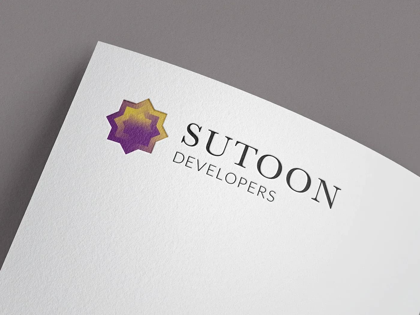
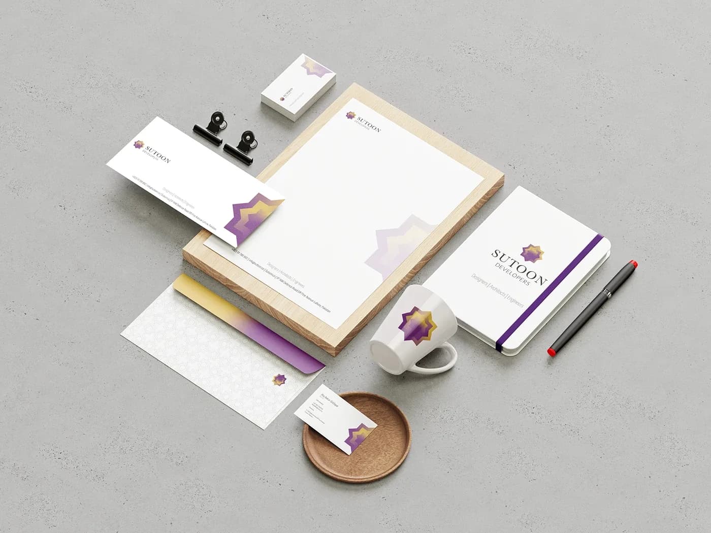
I designed the brand identity for Sutoon Developers, a real-estate developer. The system centers on a layered eight-point star mark in a purple-to-gold gradient, paired with a serif wordmark, and extends across a full stationery suite and branded merchandise, carrying the tagline "Designers | Architects | Engineers."
Challenge
A developer's identity has to feel established and trustworthy on a letterhead while still being recognizable on small items like pins and business cards. The mark needed enough character to stand alone without the name beside it.
Approach
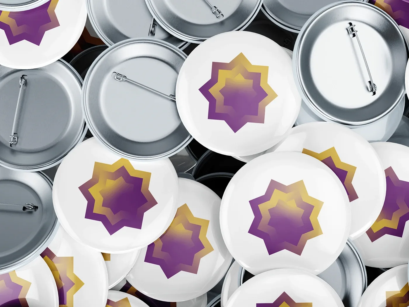
I built the mark from nested eight-point stars, a geometric form with roots in traditional patterning, and filled them with a gradient from deep purple to warm gold so the layers read as depth. For the wordmark I set SUTOON in a spaced serif over DEVELOPERS in a light sans. The stationery stays mostly white, with the star cropped at corners and edges, a faded star watermark on the letterhead, a purple band on the notebook, and a star lattice pattern on the envelope.
Outcome
I delivered a logo and wordmark, business cards, letterhead, envelopes, a notebook and a mug, plus pin-back buttons, all shown in presentation mockups. The work was produced in Illustrator, Photoshop and InDesign.
More work
Gradvisors Stationery
Stationery for Gradvisors, a career consultancy: business cards, letterhead, a branded pen and a notebook in charcoal and mint green.
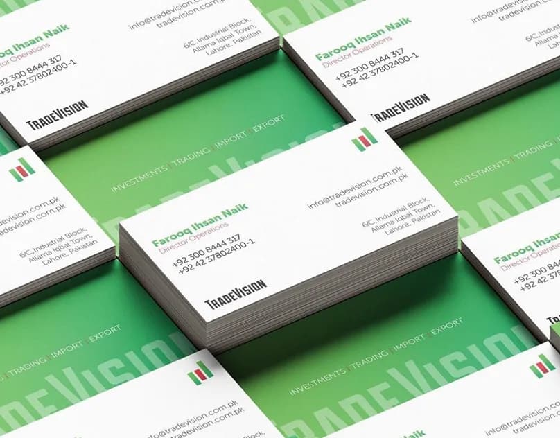
TradeVision Brand Identity
A rebrand for TradeVision, a Lahore trading and investment firm: bar-chart mark, stationery, billboard and a Dubai expo kiosk.
Growstar Products
Brand development, a web experience and AI integration for Growstar Products.