Most font pairing for brands goes wrong in the same place: two typefaces get chosen side by side in a presentation, at 72 points, on a big monitor, and they look great. Then they meet a phone screen, a Google Doc, a Spanish headline with accents and a button label at 14 pixels, and the pairing falls apart. I pick and pair brand fonts the other way round. I start from the jobs the type has to do, test at the sizes it will actually live at, and only then argue about taste.
Below is my method, from the first typeface to the web settings that keep a pairing intact. If you want the wider picture of where type sits in an identity, I cover that in how to design a brand identity system. Licensing has its own section in my brand guidelines post, so I only touch on it here.
Start with jobs, not fonts
Before I scroll a single font library, I write down what the type has to carry. For a small business that is usually five things:
- The name: the wordmark or logotype, which may be set once and then drawn into a fixed logo file.
- Headlines: short, large, read in a glance. This is where personality lives.
- Running text: service descriptions, blog posts, emails, proposals. Read for minutes at a time.
- Interface text: buttons, form labels, navigation, captions, prices. Small, functional, unforgiving.
- Data: tables, specifications, invoices, anything with numbers that need to line up.
Then I ask which job has the most volume. A printer's output is mostly specification sheets; a home care agency's site is mostly reassurance copy and forms. That job gets the most careful font choice, and it is almost never the headline.
For PrintVision, the Lahore print and packaging house I rebranded, that reasoning decided the whole typeface. The brand uses Avenir Next Condensed, and the written rationale in the brand book is short: condensed because a printer's copy is mostly specifications and specifications are dense, geometric and clean-lined because the thing being sold is technical precision. The wordmark sits in the Regular weight, upright. One family, chosen for the job with the most words.
Decide if you need a second font at all
The most useful pairing decision is often not to pair. A well-built family with a range of weights and widths can carry headlines, text and interface on its own. Google Fonts' own guide to pairing within a family and superfamily makes the case: a large family gives you enough contrast without bringing in another typeface, and staying inside it keeps spacing, proportions and motifs consistent. The same guide describes superfamilies, related serif, sans and sometimes slab or mono designs built on one structure, as a way to get variety without a mismatch.
This site is my own example. It runs on one variable family, Google Sans, for every heading, paragraph, button and caption, plus a system monospace stack for a few terminal details, which costs nothing to load. Because the font is variable, every weight comes from the same file.
I reach for a second typeface only when one of these is true:
- The brand personality needs a voice the text face cannot produce, like a warm serif for a heritage business or a heavy display face for an event.
- The headline face is a display design that becomes hard to read below about subheading size.
- The wordmark needs a distinct texture from everything else, so the name feels like an object rather than another line of copy.
If none of those apply, one family with a strict size and weight hierarchy will look more professional than two fonts fighting.
Font pairing for brands: how to tell if two fonts belong together
Google Fonts frames the core problem well in its pairing typefaces guide: the secondary face has to be different enough from the first, but not too different, a balance it describes, citing Jason Santa Maria, as distinction and harmony. The same article borrows Jessica Hische's family metaphor. A sibling shares x-height, contrast, width and mood with the primary face. A cousin shares two or three of those traits. A distant relative might share only one, which can still be enough if it is the right one.
I turn that into a set of checks I run on every candidate pair:
| Check | What I look at | Warning sign |
|---|---|---|
| x-height | Set both faces at the same size on one line, in lowercase | One face looks a size smaller, so mixed lines look like a typo |
| Width | Same word, same size, both faces | A wide headline over a condensed text face makes columns feel lopsided |
| Stroke contrast | Difference between thick and thin strokes | A high-contrast serif with a low-contrast sans can work, but two medium-contrast faces usually look like an accident |
| Mood | Read three real headlines aloud in each face | The headline face says "luxury" and the text face says "spreadsheet" |
| Role clarity | Can someone tell which face is for what, in two seconds? | Two similar sans serifs: too close to be a contrast, too different to be one voice |
The last row catches the most common mistake I see in small business rebrands: two sans serifs that are almost the same. Commit to a clear contrast, like a serif against a sans or a heavy display face against a quiet text face, or stay in one family. The muddy middle reads as indecision.
A worked example: the Sutoon wordmark
For Sutoon Developers, a real estate developer, the pairing lives inside the logo itself. SUTOON is set in a spaced serif. DEVELOPERS sits beneath it in a light sans. The faces share almost nothing in construction, which is the point: the serif carries permanence for a developer's letterhead, and the light sans recedes so the name leads.
What holds that contrast together is the shared decisions around it: both lines are capitals, both are generously tracked, and their widths relate. When the faces are very different, let spacing, case and alignment do the harmonising.
Test at the sizes the brand actually lives at
A pairing is not approved until it survives a stress sheet. Mine has these rows, each set in the real fonts with real copy, never lorem ipsum:
- A 16px paragraph of five or six lines, read on an actual phone.
- A 12px caption and a 14px button label, in the lightest weight you plan to allow.
- A headline that wraps to three lines on a narrow screen.
- A row of prices and phone numbers, to check whether figures line up and whether 1, l and I are distinguishable.
- Every language the brand uses. For agencies serving Spanish-speaking families, that means testing accents, the ñ and the opening question and exclamation marks. Test the real case, not the ideal one.
- The fallback font, because someone will open your brand in a tool that does not have your typeface.
Then I check the text against two accessibility rules that hit typography directly. WCAG Success Criterion 1.4.4, Resize Text, a Level AA requirement, says text must be resizable up to 200 percent without loss of content or functionality. Success Criterion 1.4.12, Text Spacing, also Level AA, says content must still work when a user sets line height to at least 1.5 times the font size, paragraph spacing to 2 times, letter spacing to 0.12 times and word spacing to 0.16 times. The W3C explanation is clear that text which only gets cut off once spacing is increased, with no way to reveal it, fails.
This matters for pairing. A wide display font in a fixed-width button is exactly the kind of choice that clips under those settings. I apply the 1.4.12 values with a small stylesheet override and watch what breaks. Usually the fix is in the layout, but sometimes it tells me a face is too wide for interface text and should stay in headlines.
Write the hierarchy down
Two good fonts with no rules will still drift. The deliverable I hand over is a short table, not a mood board: one row per role (display headline, section heading, body, caption, button), each with one face, one weight, a desktop and mobile size, a line height and a named fallback. Body text starts at 16px. Your team should never have to guess which weight goes on a button.
Ship it without breaking it on the web
A pairing can still flash, jump or slow the page once it loads as web fonts. Four decisions handle most of it.
Load fewer files
Google's web.dev guide to font best practices opens its advice on using fewer web fonts with the line that the fastest font to deliver is one that is never requested. It notes that a variable font can consolidate multiple font files into one, with a caveat worth knowing: a variable file is typically larger than any single static file, so it pays off when you actually use several weights or styles. It also recommends WOFF2, which it says compresses 30 percent better than WOFF. Every extra face is extra weight.
Choose what happens before the font arrives
The CSS font-display descriptor controls the gap before a font loads. MDN describes swap as an extremely small block period with an infinite swap period, and optional as an extremely small block period with no swap period at all. So swap always ends on your brand font but can visibly switch, while optional may keep the fallback on a slow connection. I use swap on this site, and I use optional for secondary faces whose absence would not hurt anyone.
Match the fallback
When a fallback and a brand font have different proportions, the swap moves text around. MDN documents the size-adjust descriptor for exactly this: it scales a font's glyphs and metrics, and can be used to override a fallback font's metrics so it better matches the primary web font.
Let the framework do the plumbing
On Next.js, I load brand fonts through next/font. The Next.js font documentation says Google Fonts are self-hosted as static assets on your own domain, so no requests are sent to Google by the visitor's browser, and it recommends variable fonts for the best performance and flexibility. That is how this site loads Google Sans, with a named fallback stack behind it.
When not to chase the perfect pairing
Typography is easy to over-invest in. A few situations where I tell clients to stop:
- Before positioning is settled. If the business has not decided whether it is warm or precise, no pairing will fix that.
- When the tools cannot use it. If most output is Google Docs, Canva and email, a font that is not available there quietly gets replaced by whatever default the tool offers. Pick a face the team can install, or plan the fallback deliberately.
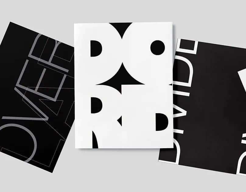
- When it is a novelty face for running text. My own typography poster series crops and overlaps letters until they become image. That is right for a poster and wrong for a service page. Expressive type belongs where people glance, not where they read.
Your font pairing checklist
- List the five type jobs and which has the most volume
- Choose the face for the highest-volume job first
- Decide if one family can carry everything before adding a second
- If pairing, pick a clear contrast and check x-height, width, stroke contrast and mood
- Test real copy at 12, 14 and 16px on a phone, plus figures and every language you use
- Check WCAG 1.4.4 resize to 200 percent and the 1.4.12 spacing values
- Write a hierarchy table: one face, weight, size and fallback per role
- Load as few WOFF2 or variable files as possible, set font-display, match the fallback
- Confirm the licence covers web, print and the team's tools
Frequently asked questions
How many fonts should a brand use?
One or two families for almost every small business. One well-built family with several weights is often enough. Add a second only when the brand needs a voice or texture the first family cannot produce, and give each face a clearly separate job.
Can I use free Google Fonts for a professional brand?
Yes, and I often do. The quality ceiling is high, and the licensing is usually simple: the Google Fonts repository states that most of its fonts use the SIL Open Font License 1.1, some use Apache 2, and every family folder ships its own licence file, which it says you should always read. The trade-off is distinctiveness: popular families appear everywhere, so I lean on a custom or modified wordmark and a strict hierarchy to make the brand feel like its own.
Should my logo font match my website font?
Not necessarily. The wordmark is usually converted to artwork, so it can use a face the website never loads. It should feel related to the headline face, though, either the same family or a clear, intentional contrast.
If you are building or refreshing a brand and want a type system that holds up from a business card to a phone screen, tell me about your business and where your brand shows up most. I will come back with a clear plan for the fonts, the hierarchy and how they will load on your site.