Most onboarding flows are a toll booth. Four swipeable screens of illustrations, a sign-up wall, three permission pop-ups, and only then the app. Good app onboarding design works the other way round: it gets a new person to the one moment where the product proves itself, as fast as possible, and moves everything else out of the way or later.
This is how I approach it, using what I learned building the first-run experience for Tackie, my goal app, and the guidance Apple and Google publish for their own platforms. I wrote about the wider story of the product in how I built Tackie. This post is narrower: the decisions that decide whether people finish your onboarding.
What onboarding is actually for
Onboarding has one job: get someone from "I just opened this" to "oh, that's useful" before their patience runs out. I call that second point the first value moment. Everything in the flow either moves a person toward it or delays it.
For Tackie, the first value moment is seeing your own vague goal turned into a first week of small tasks. So the whole first run is built to reach that screen. For a booking app it might be the first time slot that actually suits you. Write yours down in one sentence before designing a screen.
Apple's Human Interface Guidelines set the bar plainly: ideally people understand your app simply by experiencing it, and if onboarding is necessary, the flow should be fast, fun and optional. I treat "optional" as the default and make every mandatory step earn its place.
Start by deleting screens
Before designing anything new, list every screen and prompt between launch and the first value moment. Then sort each one. This is the audit I run on any first-run flow, including my own:
| Step | Usual verdict | Why |
|---|---|---|
| Feature carousel | Cut, or replace with doing | People retain more by performing a task than by viewing instructions |
| Account creation | Move later | People often abandon apps when forced to sign in first |
| Permission requests | Move to the feature that needs them | Both platforms say to ask in context |
| Preferences and settings | Replace with good defaults | Reasonable defaults let most people start immediately |
| Questions that shape the result | Keep, one at a time | They shape the result, so they are the product, not a form |
| Terms and licences | Keep out of the flow where possible | Apple says to let the App Store display agreements |
Apple's guidance backs most of these calls. It says to postpone nonessential setup flows and provide reasonable defaults so most people can start immediately, and to avoid putting licensing details in the onboarding flow where the store can show them instead. The same page suggests letting people experience the app before asking for ratings or purchases.
When I worked on the online ordering experience for The Rice Bowl, a lot of the improvement came from suggesting what to remove rather than what to add, and the streamlined flow cut ordering time from 35 minutes to 15. Onboarding is the same. The quickest win is almost always a screen you no longer show.
Let people use it before you ask who they are
The sign-up wall is the single biggest choice in a first-run flow. Apple's guidance on accounts is blunt: ask people to create an account only if core functionality requires it, and delay sign-in for as long as possible, because people often abandon apps when they are forced to sign in before doing anything useful.
On iOS this isn't only a style preference. The App Store Review Guidelines, in section 5.1.1(v), say that if your app doesn't include significant account-based features you should let people use it without a login, and that if you support account creation you must also offer account deletion within the app. Plan the deletion flow at the same time as the sign-up flow, not after a review rejection.
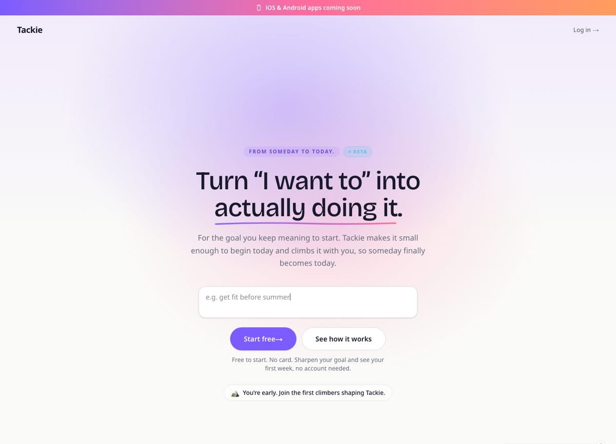
Tackie has a try-it mode for exactly this reason. You type a goal on the landing page, sharpen it, and see your first week without an account. The draft stays on your device, so signing up is how you keep something you already like. When you do sign up, there is Google sign-in, so the account step is a tap rather than a form.
Teach by doing, not by carousel
Apple recommends teaching through interactivity, because people grasp and retain information better when they actually perform the task instead of just viewing instructions. It also suggests context-specific tips shown near the part of the interface they describe, instead of one big up-front flow.
Google's older, now archived Material Design guidelines described three onboarding models that are still a useful vocabulary: Self-Select, which lets people customise their experience; Quickstart, which starts the user directly in the app; and Top User Benefits, a brief carousel highlighting up to three benefits. The same guidance says to show onboarding to first-time users and not to returning users.
My default is Quickstart with a single interactive first step. On Tackie, the onboarding is the product's input box. The hero asks you to type a goal, the button says "Start free", and the line underneath says no card and no account needed. There is no separate tutorial to skip, because the first thing you do is the real thing.
If you genuinely need a tutorial, make it skippable and findable. Apple's advice is that if people skip it on first launch, you shouldn't present it again on later launches, but you should make it easy to find later, for example in a help or settings area.
Ask questions one at a time, and only ones that change the result
Some apps need to learn about you before they can help. That's fine, as long as every question visibly changes what you get. A question that only feeds your marketing team doesn't belong in onboarding.
Tackie asks one question at a time while it sharpens a goal, and the model decides how many it needs, so a clear goal gets through quickly and a fuzzy one gets a bit more help. A form with eight fields is a wall for someone already hesitant; a conversation feels like progress.
A few rules I hold myself to:
- Show the effect. If an answer changes the plan, the next screen should make that obvious.
- Keep choice screens short. The archived Material Self-Select guidance suggested limiting choices to one screen with fewer than ten options.
- Never ask twice. WCAG 2.2 success criterion 3.3.7, Redundant Entry, says don't ask for the same information twice in the same process. If you collected an email to send a magic link, don't ask for it again on the profile screen.
Ask for permissions at the moment of need
Permission prompts are where many flows lose people, because they arrive before anyone understands why. Both platforms say the same thing. Android's documentation says to ask for a permission in context, when the user starts to interact with the feature that requires it. Apple says to avoid requesting permission at launch unless the app can't function without it, the way a navigation app obviously needs location.
The stakes are real on Android. If someone taps Deny for a specific permission more than once, the documentation says they no longer see the system dialog for it, and that counts as a permanent denial. Waste the prompt at launch and you may never get to ask again.
The web works similarly. MDN's notification example notes that the permission request should be made in response to user interaction, such as a click. For a web app with reminders, that means a button like "Remind me when this is due" attached to an actual task, not a browser prompt the second the page loads.
How to write the ask:
- Explain the benefit in a real sentence. Apple's example of a good purpose string is "The app records during the night to detect snoring sounds." Its examples of bad ones are "Microphone access is needed for a better experience" and "Turn on microphone access," which give vague or no justification.
- If you use a screen before the system alert, give it one button. Apple says to include only one button, label it something like "Continue" or "Next", not "Allow", and not to add a second button that skips the alert, because both can feel manipulative.
- Plan for no. Android's guidance is to let people use the app to whatever extent is possible without the permission, be specific about what is unavailable, and avoid persistent nagging.
Make the sign-up step easy to get through
When the account step does arrive, it should not be a memory test. WCAG 2.2 success criterion 3.3.8, Accessible Authentication (Minimum), is a Level AA requirement whose short version is don't make people solve, recall, or transcribe something to log in. In practice: let password managers fill fields, allow paste into password and code fields, and offer a method that doesn't depend on remembering anything.
Apple suggests passkeys where you don't use Sign in with Apple, because they remove the need to create or enter passwords, and says that if you do keep passwords, you should add two-factor authentication. It also says to identify the authentication method on the button, "Sign In with Face ID" rather than a generic "Sign In". Tackie offers Google sign-in and two-factor authentication, which covers the fast path and the careful path without a long form.
When a longer onboarding is the right call
Everything above assumes a consumer app where people can try first and commit later. That isn't always the situation, and copying "skip everything" into the wrong product causes its own problems.
- The setup is the product. In operational software, like the home care platform I am building with Nuraflow, nothing useful happens until the agency's services, staff and rules exist in the system. There, I'd rather have a guided setup checklist that people can leave and resume than a skip button that drops them into an empty dashboard.
- Information is required by law or by the service. The App Store guideline itself allows requiring personal information when it is directly relevant to core functionality or required by law. A healthcare intake is a good example, and I wrote about designing that kind of flow in taking home care intake digital.
- The app cannot work without a permission. Apple says that in this case it can make sense to integrate the permission request into onboarding, so you can explain why and what people get for granting it.
Measure where people stop
You can't improve a flow you can't see. Before launch, give each onboarding step its own analytics event so the steps form a funnel. For a flow shaped like Tackie's, the event list I would start with looks like this:
| Event | Fires when | What a drop here usually means |
|---|---|---|
| onboarding_started | The first-run screen renders | Baseline for every other step |
| goal_entered | The person submits their first input | The first screen asks too much or explains too little |
| question_answered | Each clarifying answer, with its position in the sequence | One question is confusing, or there are too many |
| first_value_reached | The result screen (for Tackie, the first week) is shown | The product is slow or the output disappoints |
| signup_prompted / signup_completed | The save prompt is shown and finished | The account step is too long, or the value isn't clear yet |
| permission_prompted / permission_granted | Each permission ask, logged with the feature that triggered it | The reason sentence is weak or the timing is wrong |
Track skips as their own event rather than as a missing completion, so you can tell "chose to skip" from "gave up". Then compare your flow against its own earlier versions, not against generic industry benchmarks, and change one step at a time so you know which change moved the number.
Also watch a few real people go through it without helping. The places where they hesitate, reread a sentence or tap the wrong thing tell you why a step leaks, which the funnel alone can't.
App onboarding design checklist
- The first value moment is written down in one sentence.
- Every screen before that moment has been justified, moved or cut.
- People can try the core feature before creating an account, unless the core feature needs one.
- Account deletion is designed alongside account creation.
- The first step is an interactive action, not a slideshow.
- Any tutorial is skippable, isn't shown again after skipping, and can be found later.
- Every question changes the result, and no question is asked twice.
- Permissions are requested when the related feature is used, with a specific reason.
- The app still works, in a reduced way, when a permission is refused.
- Sign-in allows password managers, paste, and a method that needs no memorising.
- Returning users skip onboarding and land where they left off.
- Each step has an analytics event, and the first value moment is tracked.
Frequently asked questions
How many onboarding screens should an app have?
As few as it takes to reach the first value moment, and often none before the main interface. If you're adding a fourth screen, ask whether it could become a tip inside the app instead.
Should I make people sign up before using my app?
Only if the core feature genuinely needs an account. Apple recommends delaying sign-in as long as possible, and the App Store Review Guidelines say apps without significant account-based features should work without a login.
When should an app ask for notification or location permission?
When the person first uses the feature that needs it, with a clear sentence explaining the benefit. Apple and Android both recommend asking in context rather than at launch, and on Android a permission denied twice stops showing the system dialog at all.
Want a second look at your first run?
If your app is losing people somewhere between the download and the moment it proves itself, I'm happy to walk through the flow with you and tell you which screens I'd cut first. You can see what I build on the services page, or get in touch and send me the app or a screen recording of your onboarding.