Most brands do not drift on their website. They drift on Instagram, one rushed post at a time. Social media templates are the cheapest fix I know: a small set of files built so the person posting can only change the parts that should change. This guide covers how I design that kit, from deciding which templates to build to locking them so a busy team keeps the brand consistent without a designer in the room.
It is a narrower job than writing brand guidelines. If you do not have a palette, two fonts and a logo suite yet, start with my brand guidelines template for small teams and come back. Templates enforce a system. They cannot invent one.
Why social media templates beat brand rules
A rule says "use the accent colour only for calls to action." A template simply has the accent colour on the call to action and nowhere else. The first depends on someone reading, remembering and agreeing. The second just works on a Friday afternoon.
The clearest example from my own work is the PrintVision social system. Each service line got one plate colour and keeps it: printing is magenta, design is cyan, experience and milestones are yellow. That one rule meant somebody who is not a designer could keep posting on brand, because there was no colour decision left to get wrong. The grid stayed coherent even when posts were made in a hurry. Everything below is a way of getting more decisions like that out of the poster's hands.
Step 1: Audit what you actually post
Do not start with layouts. Start with the last thirty or so posts, or with the posts you plan to make, and sort them by the job they do. Nearly every small business I have worked with ends up with the same five or six jobs:
- Offer or promo: a price, a discount, a deadline.
- Announcement: a new branch, a new service, a launch, a holiday schedule.
- Proof: a milestone, a review, a before and after, a project photo.
- Explainer: a tip, a process, a short carousel that teaches something.
- Evergreen info: hours, location, how to order, how to book.
- Seasonal or event: Ramzan, Christmas, a festival, an anniversary.
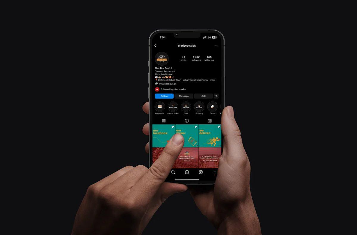
For The Rice Bowl, a Chinese restaurant in Lahore, that sort is what shaped the work. The Instagram grid system split into pinned info posts, promos and illustrated menu tiles, and the separate story campaign covered an app and website launch, online order offers, a new branch and Ramzan combos. Each of those is a job, and each job gets a template. Designing "a post template" in the abstract gets you one layout that fits none of them well.
Step 2: Design slots, not posts
A template is a layout with named slots. Before drawing anything, I write the slots down for each job, with a limit on each one. A promo template might be:
| Slot | What goes in | Limit | Locked or editable |
|---|---|---|---|
| Background | Brand colour field or photo frame | One of two approved options | Locked |
| Headline | The offer in plain words | Around six words | Text editable, style locked |
| Image | Product or service photo | Fits the frame, no stretching | Replaceable, position locked |
| Detail line | Date, terms, location | One line | Text editable, style locked |
| Logo or mark | Simplified mark | Fixed size and corner | Locked |
Writing the limits first is what stops the template breaking later. If the headline slot is sized for six words, someone will eventually paste in nineteen. Decide now whether the text shrinks, wraps to a second line, or simply does not fit, and tell the team which.
One fixed element per template
Each template needs one thing that never moves and is recognisable at a glance. On PrintVision it was the plate colour. On the BoxPark Pico work it was heavy condensed type on bright red, yellow and coral fields, plus a cheetah mascot that could carry a post on its own. Pick one anchor per template and make it loud. Five subtle anchors read as none.
Step 3: Build each template in the sizes the platforms actually use
Sizes are where most template kits quietly fail, because a layout built square gets cropped, letterboxed or scaled somewhere you did not test. Check the platform's own documentation, not a cheat sheet, and check it again every so often, because these numbers change.
- Instagram photo posts: Instagram's help page on image resolution says it keeps photos between 320 and 1,080 pixels wide at their original resolution when the aspect ratio is between 1.91:1 and 3:4, and recommends uploading at least 1,080 pixels wide.
- Instagram feed ads: Meta's Instagram Feed image ad spec recommends a 4:5 ratio at 1,440 by 1,800 pixels, in JPG or PNG.
- Reels: Instagram's reel size page allows aspect ratios from 1.91:1 to 9:16, with 9:16 as the full screen vertical format.
Notice that the organic photo range and the ad spec do not line up exactly. In practice I build a tall master for the feed, a 9:16 version for stories and reels covers, and only add a square or landscape version if the business actually posts there. Every extra size is another file someone has to keep in sync.
Stories also have parts of the screen the interface covers. I wrote up Meta's safe zone guidance, and how I applied it to an event campaign, in designing an event identity from poster to wristband, so I will not repeat the numbers here. The short version for templates: put the safe zone in the template as a hidden guide layer, so nobody has to remember it.
Design for the thumbnail too
Every post also lives as a small tile on your profile grid, and the platform decides how that tile is cropped. So I keep the headline and the anchor element near the centre of the frame, and I check every template at thumbnail size before signing it off. For PrintVision we treated the grid as a second home page, because for many buyers the Instagram profile is the first surface they see. If the identity is not legible at thumbnail scale, the template is not done.
Step 4: Lock the template so it cannot be broken
An unlocked template is a suggestion. Whatever tool your team uses, lock everything that is not a slot. In Canva, for example, Canva's help page on Brand Template locks describes a "Lock position only" option for text that fixes formatting such as font, size and colour while still letting people edit the words, and an equivalent for images and frames that lets people replace and crop the image within its space. That maps neatly onto the slot table above: style locked, content editable.
In Figma or Adobe tools I do the same job with components and locked layers, and I hand over the template in whatever the team already uses. A beautiful Illustrator file is useless to a team that only opens Canva on a phone.
Build accessibility into the locked styles
Locking also lets you get accessibility right once instead of on every post. WCAG Success Criterion 1.4.3 asks for a contrast ratio of at least 4.5:1 for normal text and 3:1 for large text, which it defines as at least 18 point, or 14 point bold. That is written for web content, not Instagram, but it is a sensible bar for text you expect people to read on a phone in sunlight. I check every text and background pairing in the template before locking it, which I cover in more depth in choosing brand colours that pass contrast.
The text baked into an image is invisible to a screen reader, so the template kit should include a line about alt text as well. Instagram's help page on alternative text explains how to write or edit alt text on a photo, before or after posting. I add a reminder to the caption checklist: if the headline is in the image, put it in the alt text too.
Step 5: Name, file and hand it over
The best template kit in the world fails if nobody can find the right file. I keep the handover boring on purpose:
- One folder, one naming pattern. Job, format, version: promo_feed_v2, promo_story_v2. No "final final."
- A one-page cheat sheet that shows each template next to an example post, with the slot limits written on it.
- An approved image folder, so the image slot gets filled with brand photography rather than whatever is on someone's camera roll.
- A caption guide of five lines: voice, emoji policy, hashtag policy, call to action wording, alt text reminder.
- A named owner who can add or retire templates. Without one, people copy an old post and edit it, and the copies drift.
Test it with the person who will use it
Before handover, I ask the actual poster, not the owner, to make three real posts from the kit while I watch. Where they hesitate, the template is unclear. Where they reach for something outside it, a content job is missing. That half hour catches more problems than any review I do alone.
When templates hurt more than they help
Templates are not always the answer, and I would rather say so than sell a kit nobody needs.
- Before the brand exists. Templating a palette you are about to change means rebuilding every file. If you are mid-rebrand, finish the system first.
- When every post looks the same. A grid of identical tiles with only the headline changing reads as wallpaper. Alternate templates with plain photography or video so the templated posts stand out. The Rice Bowl grid mixed promos, illustrated tiles and food photo rows for exactly this reason.
- For one-off campaigns. A launch or an event deserves its own art direction. It can borrow the type and colour, but forcing it into the weekly promo template wastes the moment.
- For video-first accounts. If you mostly post reels, a cover frame template and a caption style matter more than a set of static post layouts.
Keeping the kit alive
Brands drift even with templates. Every quarter or so I look at the last batch of posts beside the kit and ask three questions. Which templates did nobody use? Retire them. What did people make outside the kit? That is a missing template. Has a platform changed its sizes? Recheck the official spec pages and update the masters. A kit with five templates that all get used beats a kit with twenty that nobody opens.
Social media template checklist
- Content jobs listed, with one template per frequent job
- Slot table written for each template, with text limits
- One loud anchor element per template
- Sizes checked against Instagram and Meta's own pages, not a cheat sheet
- Safe zone guide layer in every story template
- Key content centred and legible at thumbnail size
- Everything outside the slots locked
- Text and background pairs checked against WCAG contrast
- Alt text reminder in the caption guide
- One folder, one naming pattern, one owner
- Tested by the real poster before handover
Frequently asked questions
How many social media templates does a small business need?
In my experience, five or six cover most small businesses: one per frequent content job, such as promo, announcement, proof, explainer and evergreen info, each in a feed and a story size. Start there and add a template only when people keep making the same kind of post outside the kit.
What size should I make Instagram post templates?
Instagram's own help page says it keeps photos at original resolution when they are 320 to 1,080 pixels wide with an aspect ratio between 1.91:1 and 3:4, and recommends at least 1,080 pixels wide. For ads, Meta's feed spec recommends 4:5 at 1,440 by 1,800 pixels. Check both pages before you build, because platforms change these.
Should I use Canva or a professional design tool for templates?
Use whatever the person posting already uses. I often design the system in professional tools, then build the working templates where the team lives, which for many small businesses is Canva. The locks matter more than the tool.
Will templates make my feed look repetitive?
They can, if every post uses one. Mix templated posts with plain photography, video and the occasional one-off design, and keep several templates with different anchors so the grid has rhythm rather than repetition.
Want a template kit your team can actually use?
I design social systems as part of brand work, from the content audit to the locked templates and the handover. If your feed looks like it was made by five different people, tell me what you post and who posts it, and I will come back with a plan for a kit that fits.