When someone turns on Reduce Motion on their phone or laptop, every website they visit can read that choice through the prefers reduced motion media feature. Most sites respond in one of two bad ways: they ignore it, or they switch every animation off and the page goes flat. There is a better third option. Treat the setting as a design brief, not an off switch, and the site keeps its character for the people who need it calmer.
This post is about the design side of that brief: what counts as motion, what to swap each effect for, and where personality can live once things stop sliding around. If you want the GSAP and ScrollTrigger code that wires it up, I covered that in GSAP scroll animation performance. Here I am talking about decisions you make before you open the code editor.
What prefers reduced motion actually asks for
The W3C's Media Queries Level 5 draft defines two values. no-preference means the person has not said anything. reduce means they want an interface that "removes or replaces" the kinds of motion-based animation that trigger discomfort for people with vestibular motion sensitivity, or distraction for people with attention deficits. Note the word "replaces". The spec is not asking for a dead page.
MDN's prefers-reduced-motion reference says the same thing in plainer words: the setting tells the browser the user prefers an interface that "removes, reduces, or replaces" motion, and it names scaling or panning large objects as typical vestibular triggers. It also marks the feature as widely available across browsers since January 2020, so there is no compatibility excuse left.
The accessibility standard behind it is WCAG 2.3.3 Animation from Interactions, a Level AAA criterion: motion animation triggered by interaction can be disabled, unless the animation is essential. The W3C explanation notes that parallax scrolling is often non-essential, and that reactions can include dizziness, nausea, migraines and needing bed rest to recover. A careless parallax hero can end someone's afternoon.
Motion is not the same as animation
This is the distinction that saves personality. In the WCAG glossary, motion animation means added steps between states that create the illusion of movement: an element moving into place or changing size while it appears. The same definition says motion animation does not include changes of colour or opacity that leave the element's perceived size, shape and position alone.
One correction worth knowing: the published definition still lists blurring alongside colour and opacity as exclusions, but the W3C's WCAG 2.2 errata record a June 27, 2025 change "amending the definition to not exclude blurring", and the Understanding page now carries that errata note. So I now treat blur in and out as motion, and so does Apple: its Human Interface Guidelines on accessibility list avoiding animating into and out of blurs as a reduced-motion best practice, alongside replacing transitions on the x, y and z axes with fades.
That gives you a clear design space. Under reduced motion you can still use:
- Opacity: fades and cross-fades, kept short.
- Colour: a button warming from grey to your brand colour on hover, a highlight that tints a word.
- State changes: icons swapping, a heart appearing, text changing, as long as it happens in place.
- Typography, illustration, copy and sound design choices that never moved in the first place.
What you remove or replace is travel, scaling, zooming, rotation, parallax, depth, blur transitions and anything that scrubs a large area with the scroll.
The swap table I work from
Before building, I list every moving thing on a page and decide its reduced version up front. It stops the "we'll handle accessibility later" drift. This is the table I start from:
| Full-motion effect | Reduced-motion version | Why |
|---|---|---|
| Fade-up reveal on scroll | Content visible from the start, or a plain fade with no travel | Opacity is not motion; the upward slide is |
| Parallax background or hero | Static layered composition, same images | W3C names parallax as a common non-essential trigger |
| Slide or zoom page transition | Cross-fade, or instant swap | Apple's HIG recommends fades in place of axis transitions |
| Auto-scrolling logo marquee | Static, wrapped grid of the same logos | Also needs a pause control under WCAG 2.2.2 if it runs over five seconds |
| Typing or typewriter effect | Final text appears at once | The words matter, the animation was flavour |
| Button lift on hover | Colour or shadow change only | Small, but it is still movement on every interaction |
| Animated GIF or looping video | Poster frame, play on request | Autoplay loops are both 2.2.2 and 2.3.3 territory |
| Smooth scroll to anchor | Instant jump | The Media Queries spec gives disabling smooth scrolling as an example |
| Cursor-following tilt or 3D drag | Flat, or direct manipulation with no coasting | Interaction-triggered motion is exactly what 2.3.3 covers |
The marquee row comes from WCAG 2.2.2 Pause, Stop, Hide, a Level A criterion: moving content that starts automatically, lasts more than five seconds and sits alongside other content needs a way to pause, stop or hide it. That one applies whether or not someone has set a preference, so the reduced-motion version is a bonus, not the fix. The smooth scroll row comes from the Media Queries Level 5 draft itself, which names disabling smooth scrolling and pausing marquee elements as examples of browser features this preference can affect.
How this works on my own site
My site is fairly animated: a split-flap hero board, a terminal that types commands, a scroll-driven sky, cats that wander along the header. Each one has its reduced version written into the component, not bolted on afterwards. A few examples of what I chose and why:
- The client logo marquee stops scrolling and rearranges into a centred, wrapped grid, and the duplicate copy of the track that made the loop seamless is hidden. Same logos, same social proof, no conveyor belt.
- The terminal skips the character-by-character typing and prints each command whole. The blinking caret stops blinking. You still get the joke of a working terminal on a portfolio; you just get it instantly.
- The pixel cats are where I tried hardest to keep personality. With full motion, petting a cat makes it hop, and treats send them running. Under reduced motion they stay put, and petting one, or dropping a treat, shows a small heart over the cat instead. The interaction still answers you. It just answers in place.
- The scroll-driven sky section skips its intro animation, so reduced-motion visitors and crawlers get the full-screen sky with the text already on it.
- The scroll-to-top button jumps instead of gliding.
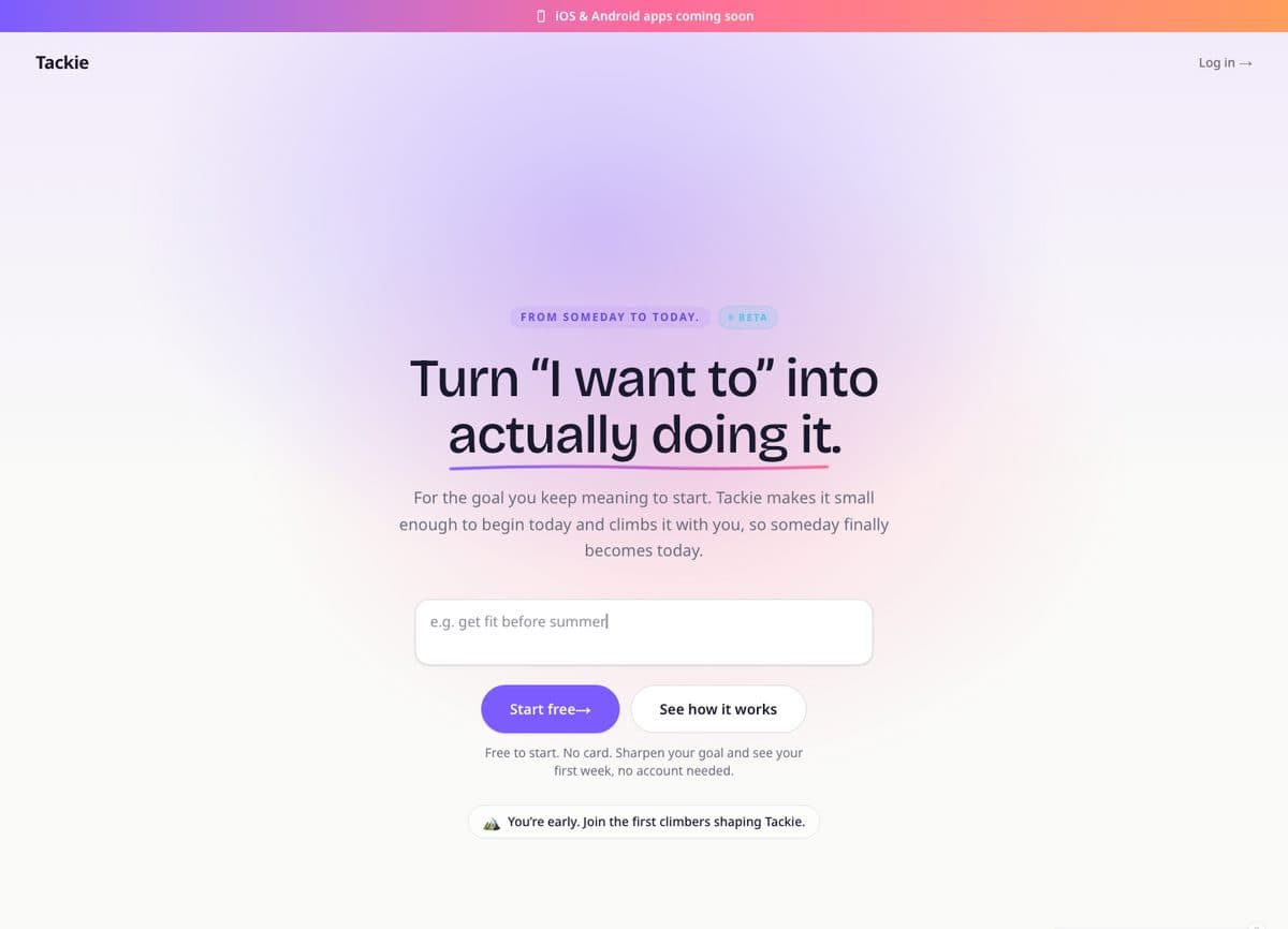
On Tackie, the goal app I am building, the animated scene simply holds still when the setting is on. I wrote about that decision in building Tackie: for an app aimed partly at people who get overwhelmed easily, a still, calm version was part of the product, not a concession.
Where personality goes when motion leaves
If a brand's character lives only in animation, it was thin to begin with. Motion should amplify things that already exist. When I strip it back, these are the places I lean on:
- Type with a point of view. A distinctive display face, confident sizes and tight, intentional spacing carry more personality than any reveal. My notes on accessible home health websites cover why readable body text still has to come first.
- Copy that sounds like someone. Microcopy on buttons, empty states and error messages costs nothing in motion terms and is where people notice a voice.
- Composition that implies movement. Overlapping layers, tilted cards, cropped images and a strong diagonal can feel dynamic in a still frame. A parallax hero's static fallback should look like a deliberate layout, not a parallax hero that broke.
- Colour and state feedback. A hover that floods the button with colour, a selected state with real contrast, a success message that changes the page tint. All allowed, all expressive.
- Illustration and imagery. A hand-drawn texture or a well-art-directed photo does the job a floating 3D blob was trying to do.
Implementation patterns that keep the design honest
Build still first, add motion for people who want it
Google's web.dev article on prefers-reduced-motion shows two shapes: a reduce block that switches animation off, and a no-preference block that switches it on. I prefer the second as the default, because the still version becomes the baseline every browser gets, and motion is the opt-in layer:
.card { opacity: 1; }

@media (prefers-reduced-motion: no-preference) {
  .card { animation: rise 0.6s ease-out both; }
}

@keyframes rise {
  from { opacity: 0; transform: translateY(24px); }
}
The same article shows you can go further and load a whole animation stylesheet only for people who want it, with media="(prefers-reduced-motion: no-preference)" on the <link> tag.
Swap animated images with <picture>
web.dev also shows that the media attribute on a <source> can serve an animated GIF, WebP or AVIF only when the preference is no-preference, with a static <img> as the fallback. That is the cleanest way I know to keep an animated brand mark for most visitors without forcing it on anyone.
Listen for changes in JavaScript
CSS rules update automatically when someone flips the setting mid-visit. JavaScript animations do not. web.dev's example uses matchMedia('(prefers-reduced-motion: reduce)') with a change listener to stop in-flight animations, and points out that the parentheses inside the string are required. My paper-crumple effect does this: when the setting turns on, its tilt targets reset to zero straight away.
Avoid the blanket kill switch
A common snippet sets every animation and transition duration to almost zero under reduce. I understand the appeal, and it is better than nothing on a legacy site. But on a site you are designing, it also removes the fades and colour transitions that sit outside WCAG's definition of motion animation, which are exactly the ones carrying the personality. MDN's own example takes the opposite approach: under reduce it swaps a scaling pulse for a slow opacity dissolve rather than deleting it. I would rather decide effect by effect using the swap table.
When not to keep an effect at all
Sometimes the honest answer is that an effect should not exist for anyone. I cut it rather than designing a reduced version when:
- It sits on a form, a price, a booking flow or legal text. People in those moments want to finish, not be entertained.
- It hides content until it plays. If the reveal fails, the content is invisible.
- It exists because a template had it, not because it says anything about the brand.
And sometimes motion really is essential. WCAG allows that: a video, an animation editor's preview, a demo of how a product moves. Those stay, but they still deserve play and pause controls.
A checklist before launch
- Inventory every moving element on the page, including hover effects and loaders.
- Write the reduced version for each in a swap table before building.
- Turn reduced motion on at the operating system level. MDN lists the paths, for example Settings, Accessibility, Motion on iOS, and Settings, Accessibility, Remove animations on Android 9 and later.
- Scroll the whole site. Everything visible, nothing sliding, zooming, blurring or scrubbing.
- Check autoplaying content over five seconds has a pause or stop control regardless of the setting.
- Toggle the setting mid-visit and confirm JavaScript effects stop without a reload.
- Ask the pride question from the callout above.
Frequently asked questions
Does prefers reduced motion mean no animation at all?
No. The Media Queries spec says the preference asks to remove or replace motion that triggers discomfort or distraction. Fades and colour changes that do not change an element's size, shape or position are outside WCAG's definition of motion animation, so they are usually fine. Keep them short and calm.
Which WCAG level covers reduced motion?
The criterion that covers it, WCAG 2.3.3, is Level AAA, the strictest level, so teams aiming for AA often treat it as a stretch goal rather than a baseline. I build it in anyway because it is cheap and the people it protects are real visitors. Pause controls for autoplaying motion fall under 2.2.2 Pause, Stop, Hide, which is Level A.
Should I add my own motion toggle to the site?
It is a valid approach: the 2.3.3 Understanding page lists "allowing users to set a preference that prevents animation" as a sufficient technique, and its parallax example uses a control at the top of each page that works as a site-wide setting. I treat a toggle as an addition, never a replacement. Respect the operating system setting first, because people should not have to find your switch on every site.
How do I test it without changing my phone settings?
Chrome DevTools can emulate the preference from its Rendering tab. I still check on a real device with the setting on, because that is where you catch the hover effects and loaders that emulation-only testing misses.
Want motion that works for everyone?
I design motion as a layer on a site that already stands on its own, and I write the reduced version alongside the full one. If your site feels dizzying, or goes oddly flat when reduced motion is on, see what I offer on my services page or send me the link. I will walk through each effect with you and tell you which to keep, which to swap and which to cut.